Create Candlestick Charts For Stocks Using Yahoo Finance
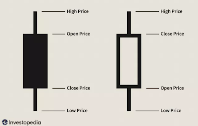
In this article, we will see how to create candlestick chart with historical data for any given symbol using open financial API named Yahoo Finance and Python. We will start by pushing data in a CSV file and then we will use Plotly to create the candlestick chart in Python. Introduction to candlestick chart This is one of the heavily used charts you may have seen multiple times while dealing with stock market dashboards. This is very much used by traders as it provides price movement based on the past patterns. One candle represents 4 points: Open, Close, High, Low as shown below: In above figure, first candle is filled which depicts that open price was higher than close price. Similarly, second candle depicts that close price was higher than open price. Here do not focus on the color of candle as it can be configured based on your favorite color, based on the dashboard you are using. In general, bullish candlestick (close price > open price) is represented by ...