In this article, we will see how to create candlestick chart with historical data for any given symbol using open financial API named Yahoo Finance and Python. We will start by pushing data in a CSV file and then we will use Plotly to create the candlestick chart in Python.
Introduction to candlestick chart
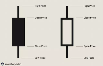
This is one of the heavily used charts you may have seen multiple times while dealing with stock market dashboards. This is very much used by traders as it provides price movement based on the past patterns. One candle represents 4 points: Open, Close, High, Low as shown below:
In above figure, first candle is filled which depicts that open price was higher than close price. Similarly, second candle depicts that close price was higher than open price. Here do not focus on the color of candle as it can be configured based on your favorite color, based on the dashboard you are using.
In general, bullish candlestick (close price > open price) is represented by green color and bearish candle stick (close price < open price) is represented by red color. You may also feel the bar chart and candlestick chart looks same. But actually that is not the case. Both these charts show same information but are differ in visual.
Install dependencies:
The very first step, we need to take is to install all the required dependencies. There could be multiple ways to perform this step, but I'm using requirements.txt having list of all the packages which needs to be installed. So, go ahead and create a file named requirements.txt with below packages added to it:
- pandas
- plotly
- yfinance
Here, pandas is used for data frame, Plotly is used for charting and yfinance is used for yahoo finance.
There is no hard rule to install the packages using requirements.txt. I chose this way as it makes package and dependency management much easier. To install the packages using requirements.txt file, fire the below command in your terminal:
pip install -r requirements.txt
Import packages
    import pandas as pd
    import yfinance as yf
    import plotly.graph_objects as go
Pull stock data using Yahoo finance
Next, we need to pull symbol specific data using yfinance and save it in CSV format. For example purpose, I'm taking TSLA symbol, which represents TESLA.
    stock = yf.Ticker('TSLA')
    data = stock.history(period="100d")
    data.to_csv('yahoo.csv')
At this point, we have all the data required for our candlestick chart
Create candlestick chart using Plotly
To plot the chart, we will read data from CSV file, set parameter for x-axis and other parameters which are required for drawing a candlestick. Here is the code for that:
    df = pd.read_csv('yahoo.csv')
    candlestick = go.Candlestick(x=df['date'], open=df['open'], high=df['high'], low=df['low'], close=df['close'])
    fig = go.Figure(data=[candlestick])
    fig.show()
On executing above lines of code, you would be able to se beautiful candlesticks as shown below:
Hope you enjoyed reading this article. If you want to have a video recording of this sample application, please visit it on my YouTube channel named Shweta Lodha.


Comments
Post a Comment